
Tune in for Google I/O on May 14
Discover Google's latest developer tools and learn how to transform your work with innovation.
Register now| Android Basics with Compose | Learn the basics of building Android apps with Jetpack Compose, the recommended UI toolkit for building Android apps | developer.android.com/courses/android-basics-compose/course | product:android | 06-01-2023 | True |
Start building today


What are you developing for?
Select your development focus to find helpful solutions and resources


Trending news
Gemini 1.5 Pro available via the Gemini API
Gemini 1.5 Pro, with a first-ever native audio (speech) understanding capability and new File API, is now available in public preview via the Gemini API in 180+ countries.

New Gemma models for developers and researchers
Introducing CodeGemma for code completion, generation, and instruction-following tasks, and RecurrentGemma, an efficiency-optimized architecture for research experimentation.
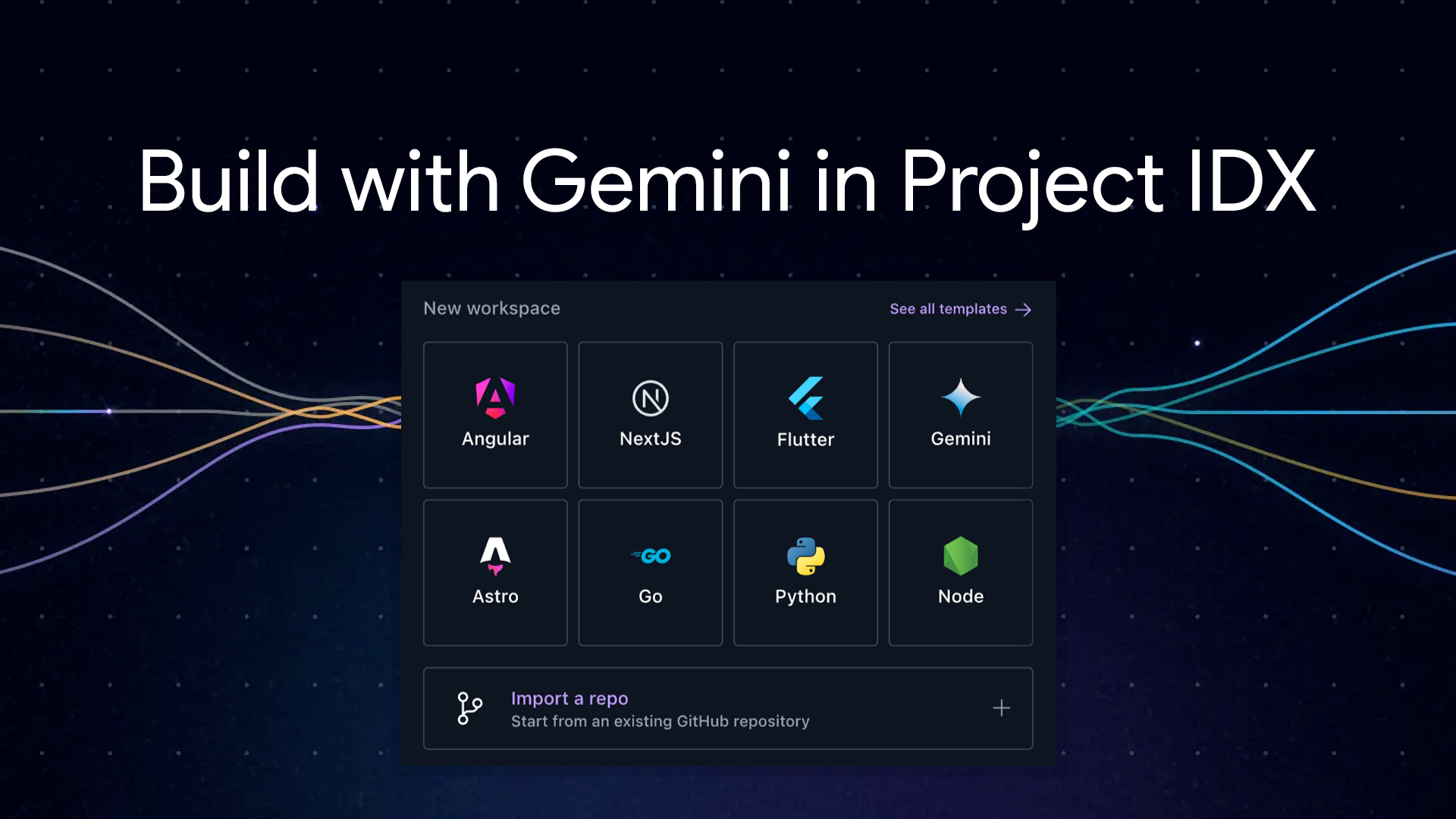
Build with Gemini models in Project IDX
Project IDX streamlines coding with AI. Get code help, error fixes, and easily integrate AI features using the Gemini API.

What's new in Android
Android Studio Iguana is now stable
Android Studio Iguana is here! Debug faster, build better UIs, and test seamlessly in Android Studio's latest stable release.


Follow Google for Developers

YouTube
Subscribe to join a community of creative developers and learn the latest in Google technology.

Follow and discover developer resources, community events, and inspirational stories.

Join a community of creative developers and learn how to use the latest in technology.

X
Join the conversation to discover the latest developer tools, resources, events, and announcements.